
Through the Lens: Crystal Care Solutions Unveils Visionary Identity for 20th Anniversary
RESIDENTIAL [EBD] - PLACEMENTS: THROUGH THEIR EYES
In the specialist care sector, brands often lean toward the clinical or the overly sentimental. As Crystal Care Solutions (CCS) approaches its landmark 20th anniversary, the organisation is breaking that mould, unveiling a brand evolution that positions care not as a "social cost," but as a "human investment."
Drawing inspiration from the long-term brand transformations of giants like Sky this evolution is the culmination of a two-decade journey. It moves CCS away from the traditional "care home" aesthetic toward a fresh, visionary community identity.
Vix Box, Box3Media, Creative Director
The creative centerpiece of the evolution is the reimagining of the existing logo’s bubbles into "The Lens of Care." No longer disconnected shapes, these circles now act as purposeful viewpoints. "By pivoting to the concept 'Through Their Eyes,' we shift the focus from the management of care to the experience of care," says the Creative Direction team. "We aren't just looking at the residents; we are looking at the world from their perspective to ensure it is safe, vibrant, and full of potential."
Strategic Sophistication
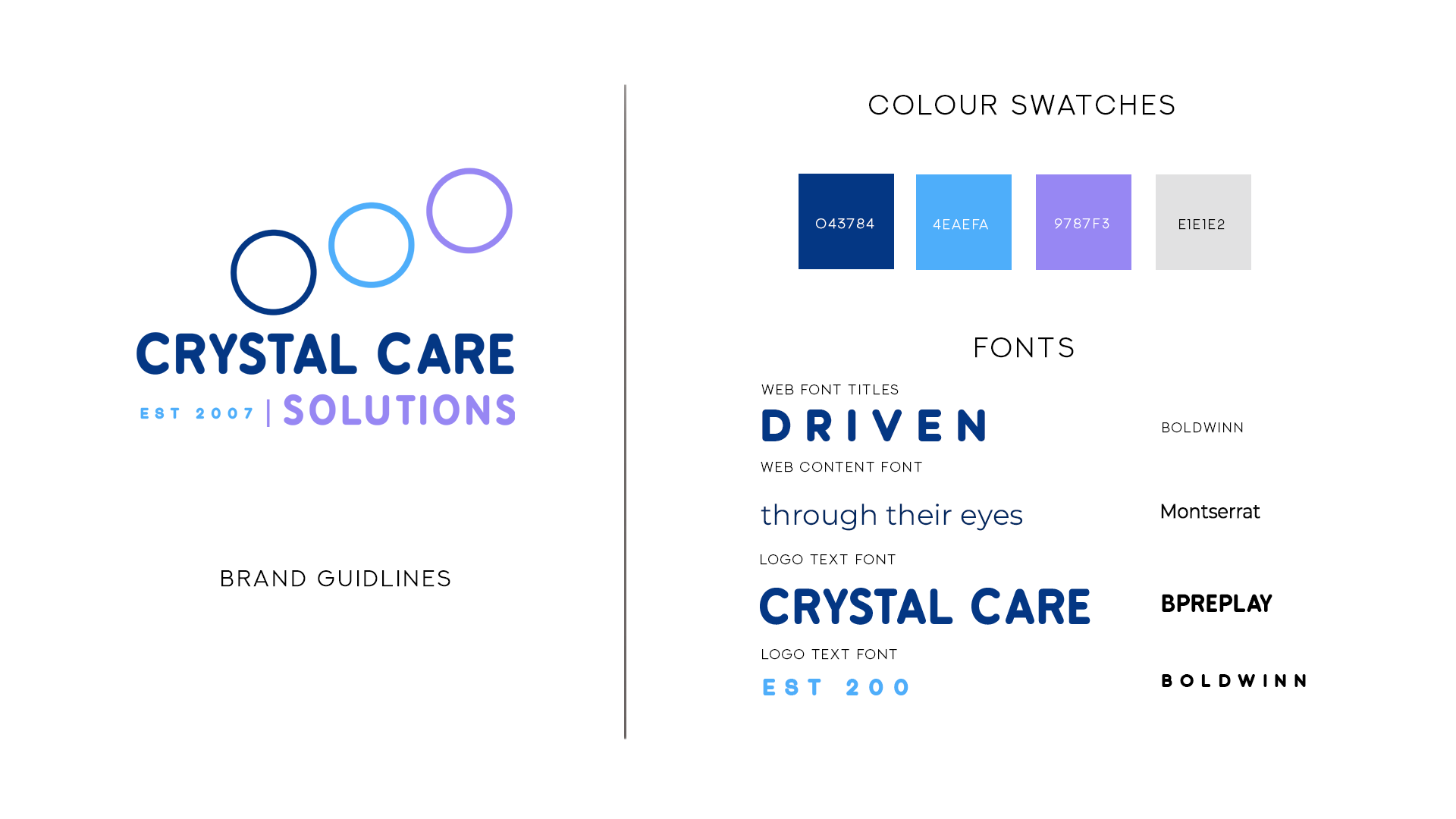
The visual language has been refined with a high-end palette:
Deep Purple: Conveying authority and the "Disciplined Excellence" for which CCS is known.
Stability Blues: Promoting cleanliness and reassurance for commissioners.
The "Roof" Alignment: The three service lenses have been moved to sit directly above the brand name, symbolising a protective "foundation" for the homes.
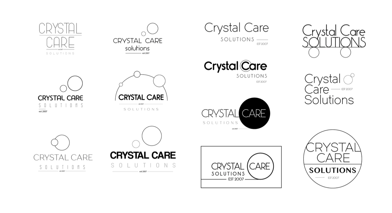
The Power of "The Lens"
The Power of
"The Lens"
Driven by People. Defined by Care.
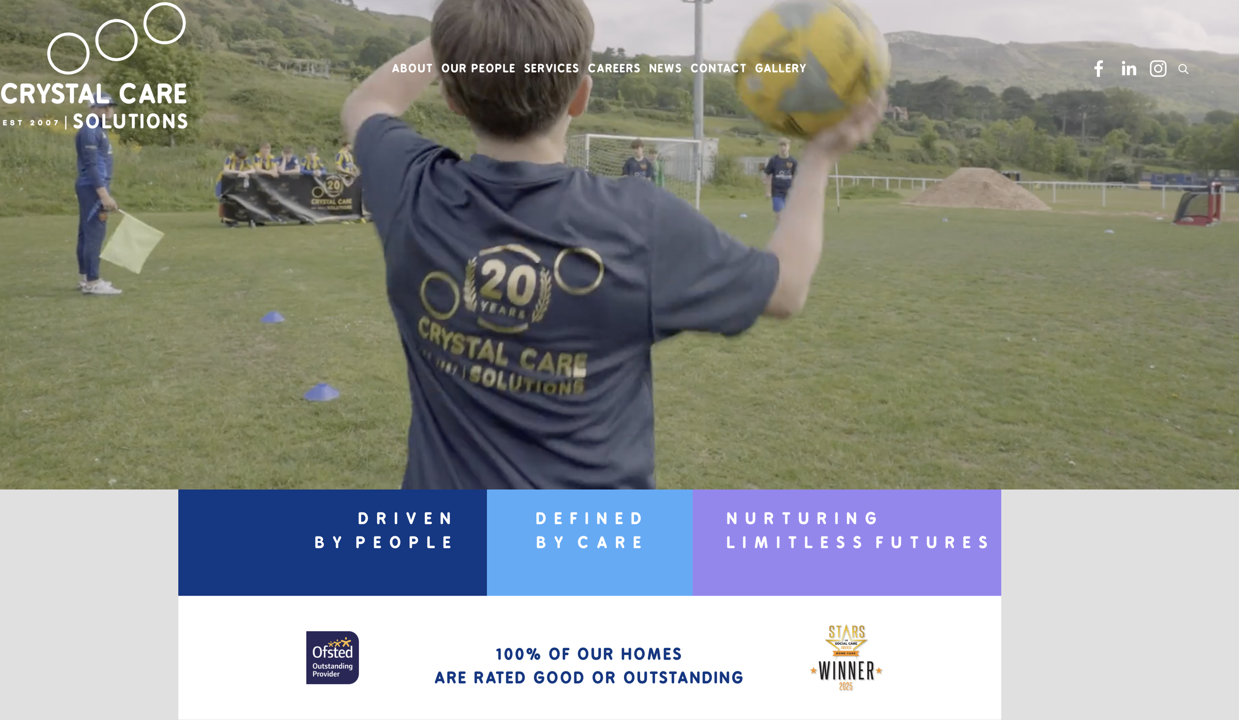
The new brand proposition is reinforced by a potent new tagline: "Driven by People. Defined by Care. Nurturing Limitless Futures." This reflects the "Owner’s Mindset" required of every staff member while promising a future without boundaries for the young people in their care.
"Working with CCS was about understanding who they are, their commitment to the young people and turning this focus into a strategy. We didn't need to invent a new story; we just needed to tell the existing one with more gravity. This brand now speaks the same language as the world-class care provided inside their environments."
— Creative Director @ Box3Media
As CCS enters its third decade, the visual identity is anchored by a "Reinforcer Line" that speaks for itself: 100% of our homes are rated Good or Outstanding. It is a statement of excellence that proves, when you see the world through the eyes of a child, the potential is truly limitless.